

Booking Flow UX
Solo Project
1 Day Sprint
OVERVIEW
Building a Faster and More Confident Ride-Booking Experience
Ride-booking apps are often used in fast-paced situations where users need to quickly search destinations, compare ride options, and confirm bookings with minimal effort.
The objective of RAP was to design a modern and production-ready passenger booking experience that prioritizes speed, simplicity, accessibility, and clear decision-making throughout the ride journey.
PROBLEM
Users Need Speed and Clarity During Ride Booking
While analyzing modern ride-booking experiences, I observed that users often interact with these platforms in time-sensitive situations where quick decisions and clear information become critical.
Even small friction points like unclear pricing, cluttered ride comparisons, excessive typing effort, or confusing booking flows can slow down decision-making and reduce booking confidence.
This revealed an important challenge — How might we create a ride-booking experience that feels fast, trustworthy, and effortless during real-world usage?
OBJECTIVE
Reduce Booking Friction to Improve User Confidence
The goal was to simplify the passenger journey by improving how users:
•
Search destinations
•
Compare ride options
•
Understand pricing
•
Track rides
•
Complete trips
By creating a cleaner and more structured booking flow, the experience aims to support faster decisions and smoother ride completion.
KEY INSIGHTS
Users Don’t Want Complexity — They Want Clarity
While exploring ride-booking experiences and passenger workflows, a few consistent usability patterns became clear:
•
Users prefer minimum typing effort during destination search
•
Fare comparison becomes difficult when ride information lacks hierarchy
•
Real-time tracking experiences must feel visually clear and trustworthy
•
Confirmation screens should reduce uncertainty before booking
•
Large touch targets and spacious layouts improve usability during movement
These observations highlighted that the experience should prioritize — Fast actions, readable hierarchy, and low cognitive effort.
OPPORTUNITY
How Might We Make Ride Booking Feel Faster and More Reliable?
I focused on creating a ride-booking experience that:
•
Reduces interaction friction
•
Improves fare comparison clarity
•
Simplifies navigation between booking steps
•
Supports real-world usability through clean hierarchy and spacious layouts
•
Maintains production-ready consistency across screens
EXPLORATION & DESIGN DECISIONS
Shaping the Experience to Reduce Booking Friction
From Insights to Design Decisions:
Users need to begin booking quickly:
•
Added a prominent destination search entry point with quick-access saved places
Users want to reduce repetitive typing effort:
•
Included recent destinations and saved locations for faster navigation

Users struggle to compare ride options quickly:
•
Designed structured ride cards with clear fare hierarchy, ETA, and capacity details
Users need confidence before confirming bookings:
•
Added clear pickup/drop summaries, payment visibility, and pricing breakdowns
Users rely heavily on trust during live ride tracking:
•
Prioritized driver visibility, ETA updates, and communication actions


Users expect simple trip completion experiences:
•
Created transparent fare breakdown and smooth payment confirmation flow
These decisions aim to create a cleaner, faster, and more confident ride-booking experience.
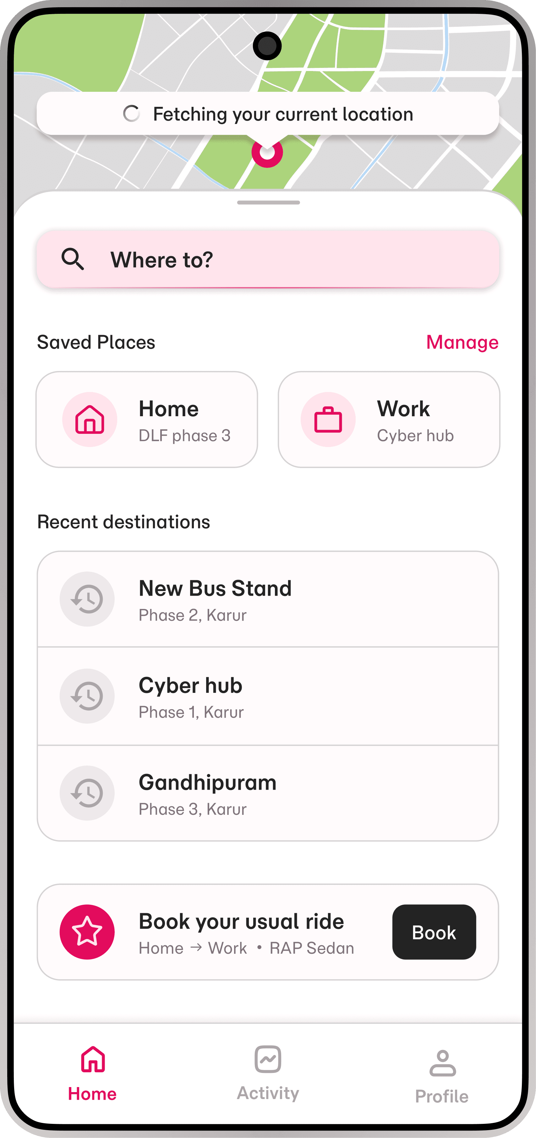
HOME EXPERIENCE
Creating a Fast and Minimal Booking Entry Point
The home screen was designed to help users begin ride booking with minimal interaction effort.
Key Decisions:
•
Large destination search field for immediate action
•
Saved locations for quicker access
•
Recent destinations to reduce repetitive input
•
Spacious layout for accessibility and faster scanning
•
Bottom navigation kept minimal to reduce distractions
Outcome:
The experience supports quicker ride initiation while maintaining visual clarity and usability.

DESTINATION SEARCH
Reducing Typing Effort During Location Selection
The destination flow focuses on helping users search and confirm routes quickly.
Key Decisions:
•
Structured pickup and destination hierarchy
•
Recent searches and saved places for reduced effort
•
Minimal visual distractions during search
•
Map confirmation to improve route confidence
Outcome:
The flow simplifies location selection while supporting faster task completion.

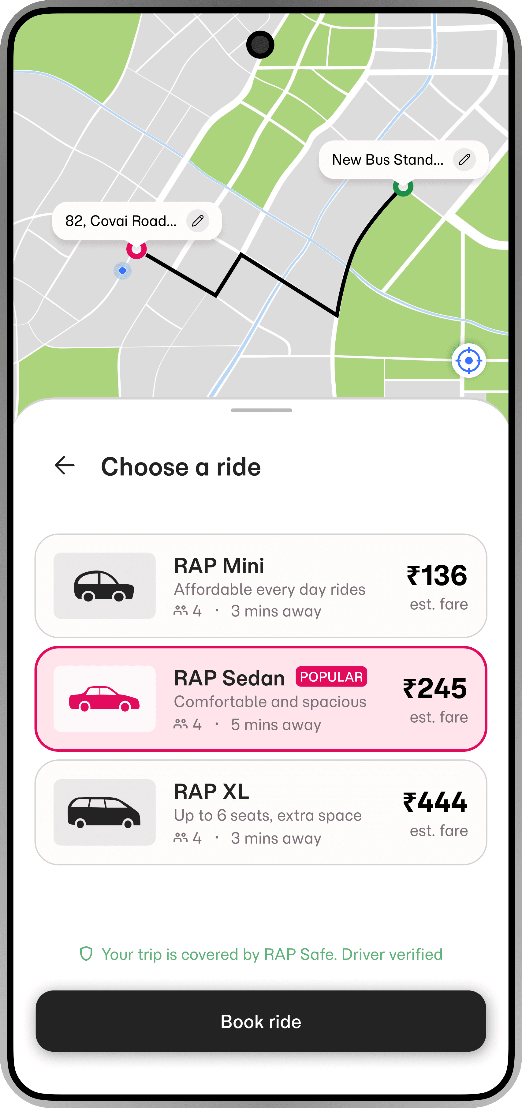
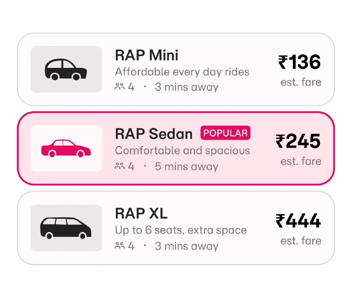
RIDE SELECTION
Making Ride Comparison Faster and Easier
The ride selection experience was designed to improve pricing clarity and reduce comparison friction.
Key Decisions:
•
Consistent ride cards with reusable structure
•
Strong visual hierarchy for fare visibility
•
ETA and seating capacity included within cards
•
Clear selected states for interaction feedback
•
Spacious spacing for readability
Outcome:
Users can compare ride options more quickly and confidently.

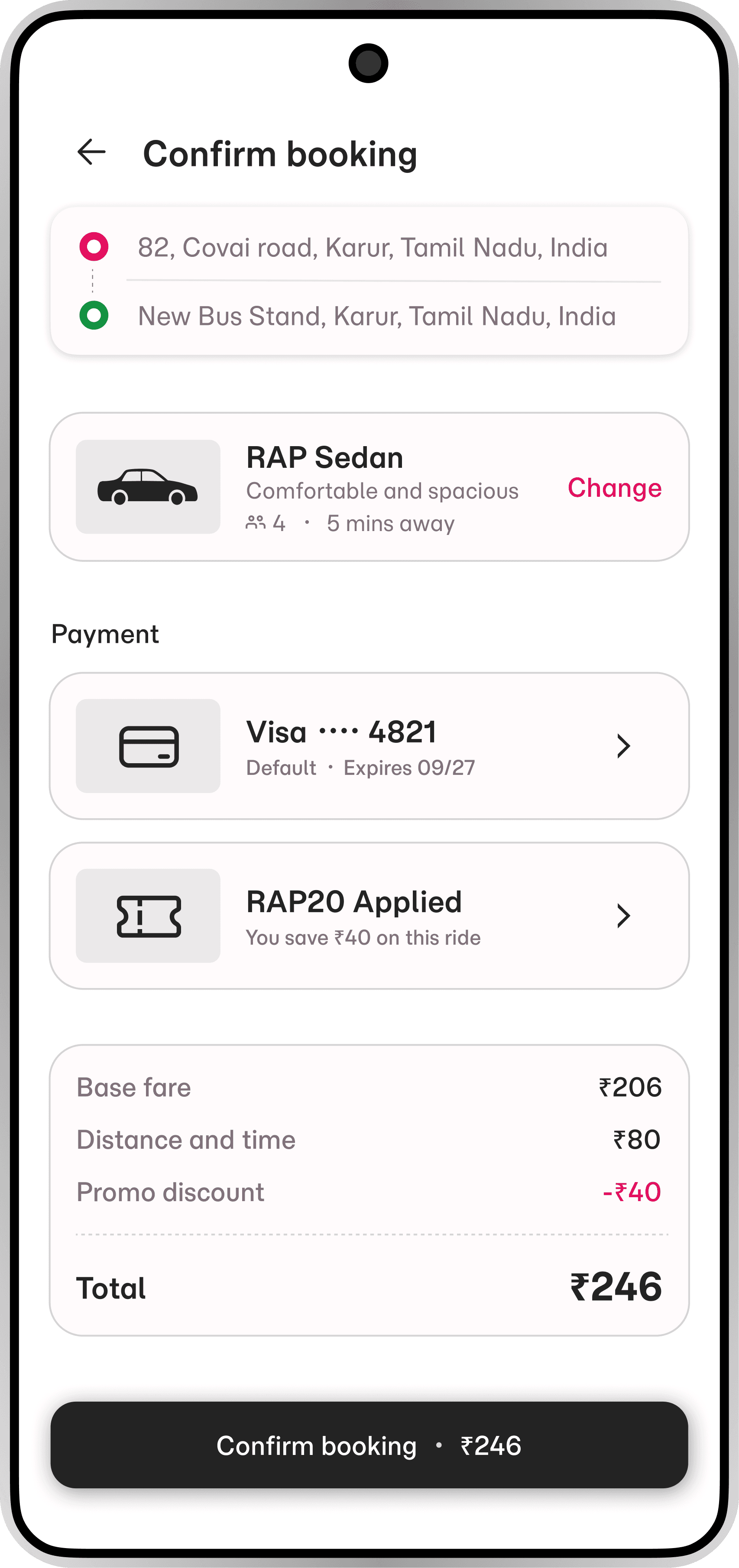
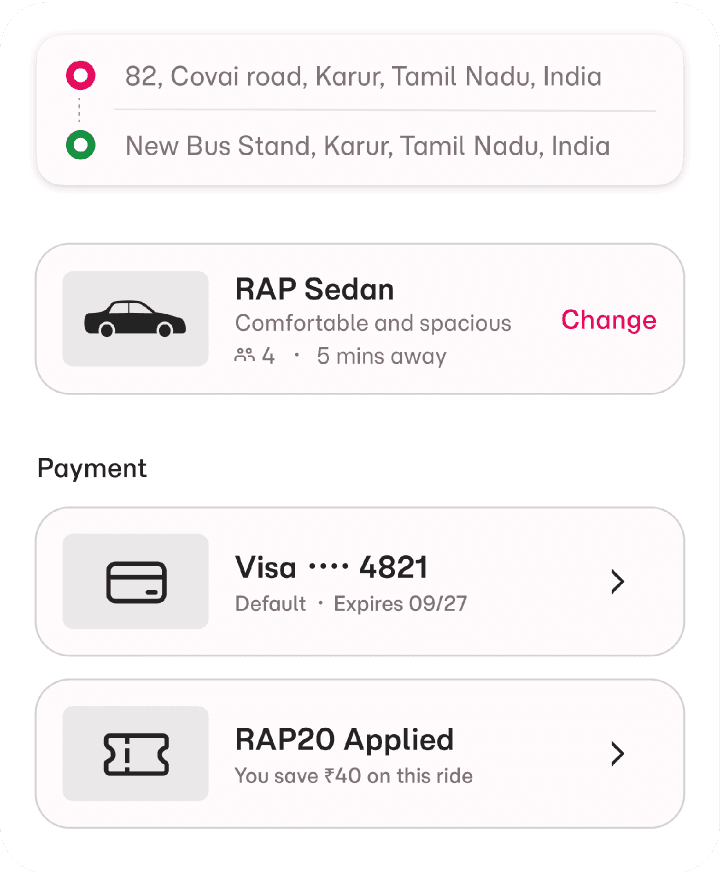
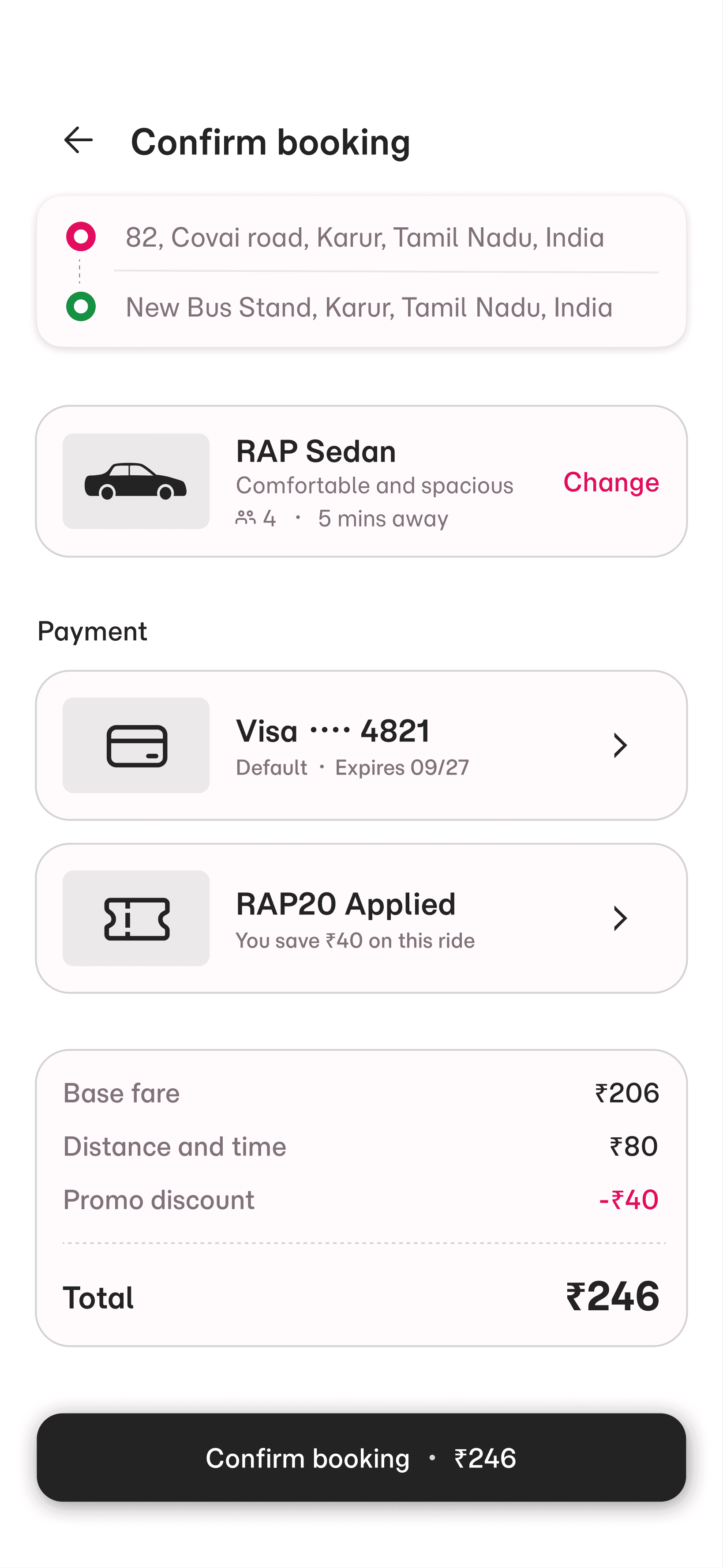
BOOKING CONFIRMATION
Increasing Trust Before Final Booking
The confirmation screen focuses on reducing uncertainty before users confirm rides.
Key Decisions:
•
Clear pickup and drop visibility
•
Payment method visibility before confirmation
•
Transparent fare breakdown
•
Strong primary CTA hierarchy
•
Reduced visual clutter
Outcome:
The screen improves booking confidence through clarity and transparency.
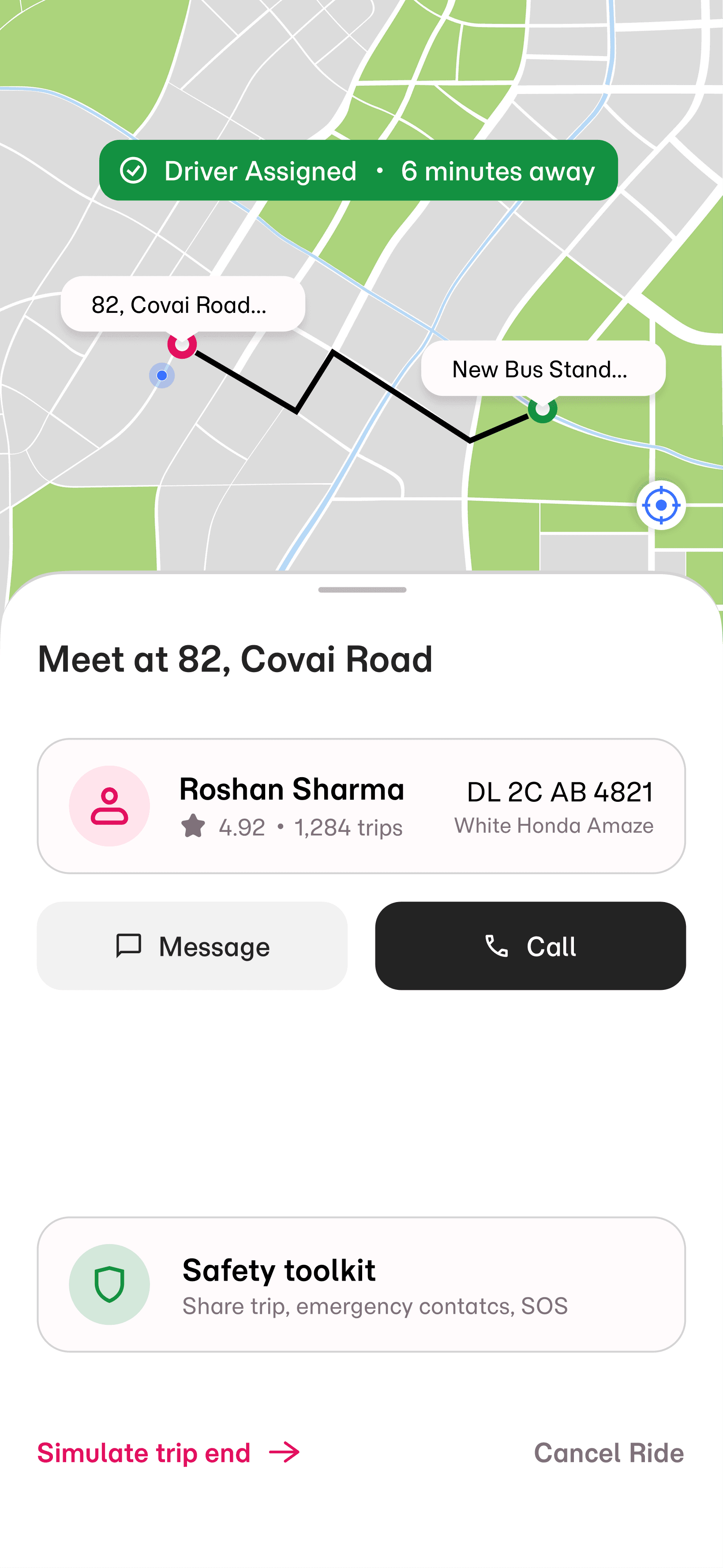
LIVE DRIVER TRACKING
Improving Real-Time Clarity and Passenger Trust
The tracking experience was designed to feel clear, safe and reliable during live rides.
Key Decisions:
•
Driver information prioritized for quick recognition
•
Clear ETA visibility
•
Simple call and message options
•
Minimal interface distraction during tracking
•
Safety toolkit access included within the reach
Outcome:
The experience improves trust and communication during active rides.
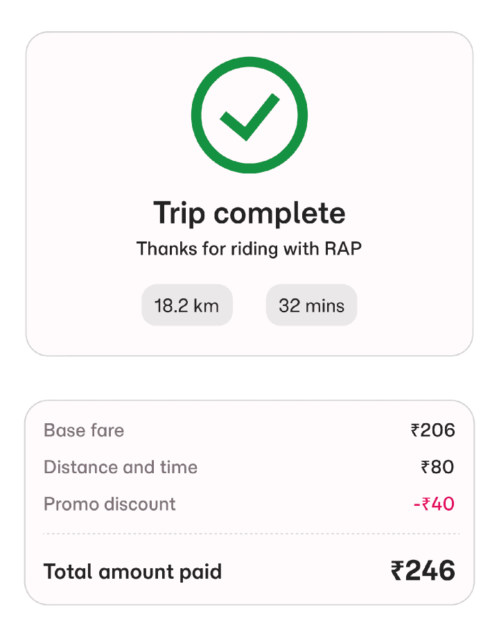
TRIP COMPLETION
Designing a Smooth and Transparent Ride Completion Flow
The completion flow focuses on closing the experience with minimal friction.
Key Decisions:
•
Transparent fare breakdown
•
Payment confirmation visibility
•
Simple review interaction
•
Invoice download accessibility
•
Minimal completion steps
Outcome:
The flow creates a smoother and more trustworthy trip-ending experience.

DESIGN SYSTEM
Building a Consistent and Scalable Interface
To maintain consistency across the booking journey, I created a lightweight design system focused on clarity, usability, and production readiness.


Colour Systems
A minimal color palette was used to establish hierarchy and guide user attention.
Typography
A structured typography scale was created to support fast scanning and readability.
Components
Reusable components were designed to ensure consistency across screens.
•
Ride Cards
•
Buttons
•
Status Chips
•
Search Fields
•
Action Cards
OUTCOME AND REFLECTION
Creating a Cleaner and More Confident Ride-Booking Experience
RAP was designed as a production-focused mobile ride-booking experience that prioritizes usability, speed, and visual clarity across the passenger journey.
The project helped strengthen:
•
UX decision-making
•
Mobile interaction design
•
Design system thinking
•
Production-ready UI structuring
•
Real-world usability considerations
The final experience focuses on helping passengers complete bookings faster with greater confidence and reduced friction.
PROTOTYPE
Explore the Interaction Flow
A clickable prototype was created to demonstrate how users move through key decision points in the experience.